Ya Qin designs experiences that connect people, products, technology, and environments, turning ideas into practical solutions.
Harvard | Parsons
Environments & Objects
Interfaces & Systems
Branding & Graphics
Materials & Sustainability
Playground
About
Linkedin


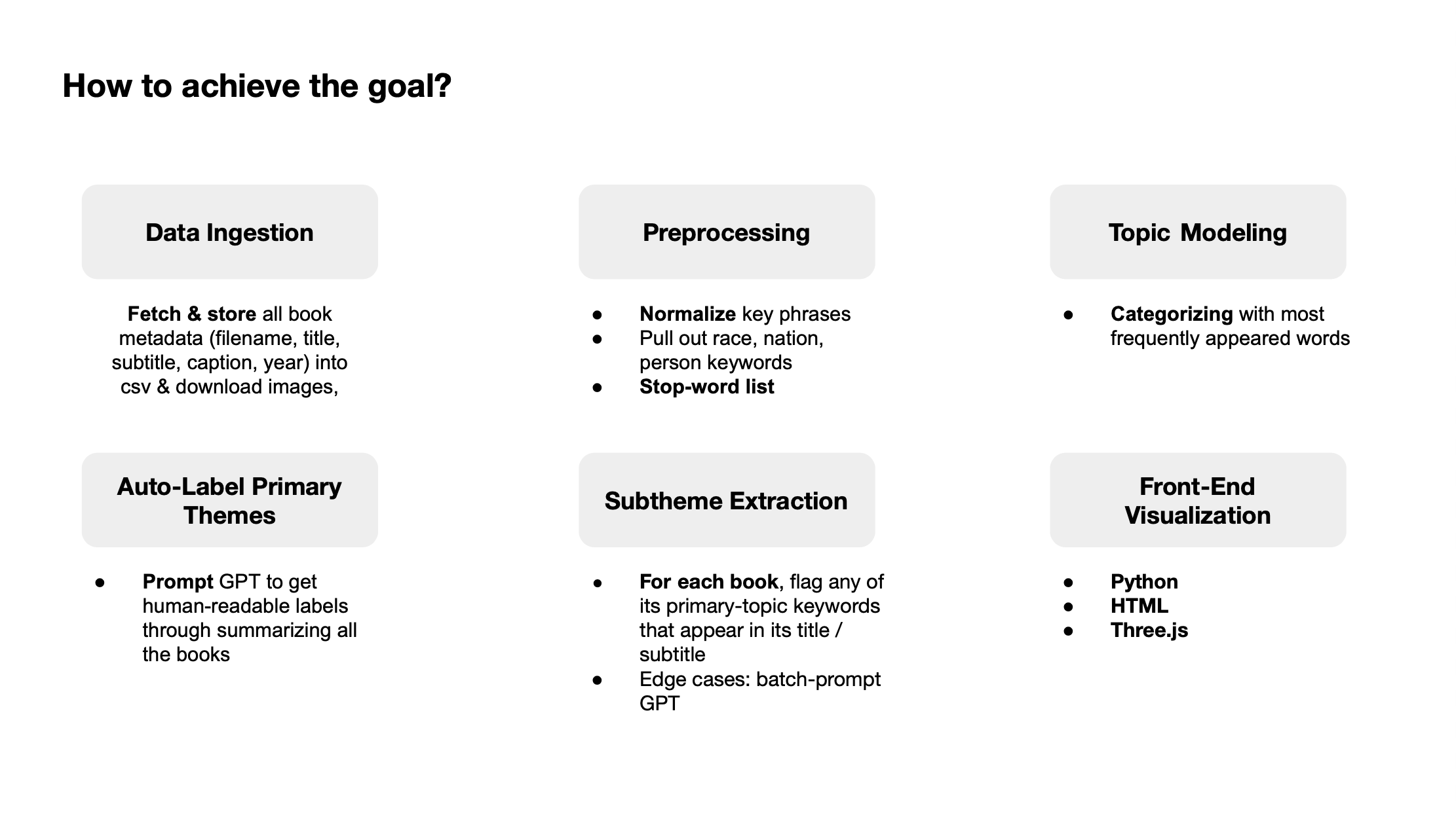
Iteration 1: 3D Face Galaxy
Each star represents a data point linked to a book. Hovering reveals book information, and as the user moves closer, the star transforms into a face image. This selective reveal introduces surprise, encourages exploration, and optimizes performance by minimizing real-time rendering load.
However, feedback pointed out that the stars—shown only as white dots—feel too abstract and don’t reflect the richness of the dataset when no images or content are shown upfront.
 Img 2.2
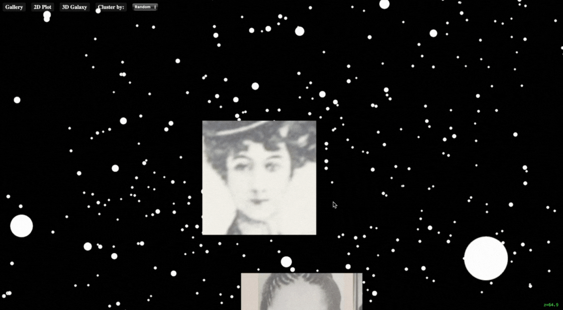
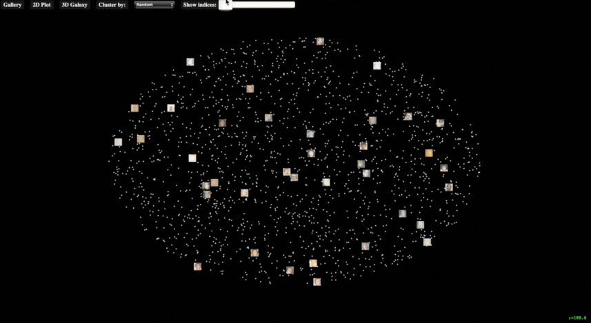
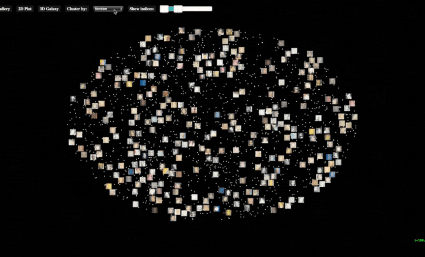
Iteration 2: 2D Face Galaxy
With around 2,000 data points, users can drag a slider to filter and reveal a specific range of images, making the entire dataset more visually accessible. The 2D layout also solves a key issue from the 3D version—avoiding image overlap that occurred when displaying all images at once.
Img 2.2: Sorting data into clusters reveals visual patterns, helping users grasp the underlying logic and structure of the archive.
However, the abundance of information still keeps the visualization at a high-level overview, offering limited depth into individual data entries.
FINAL DESIGN
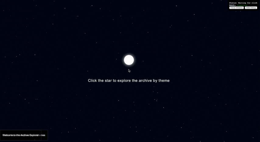
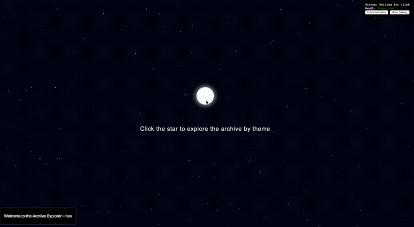
1. Landing Page
Designed to slow the pace, the landing page invites users to pause, unwind, and focus their attention on the experience ahead.
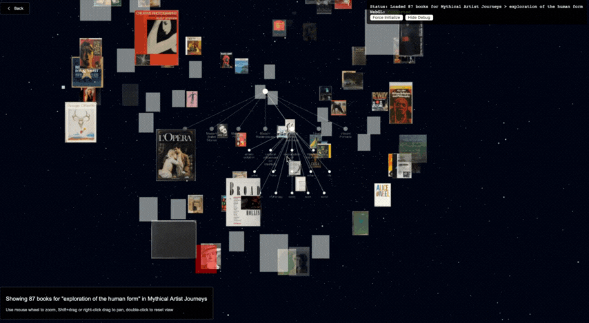
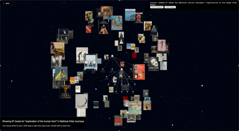
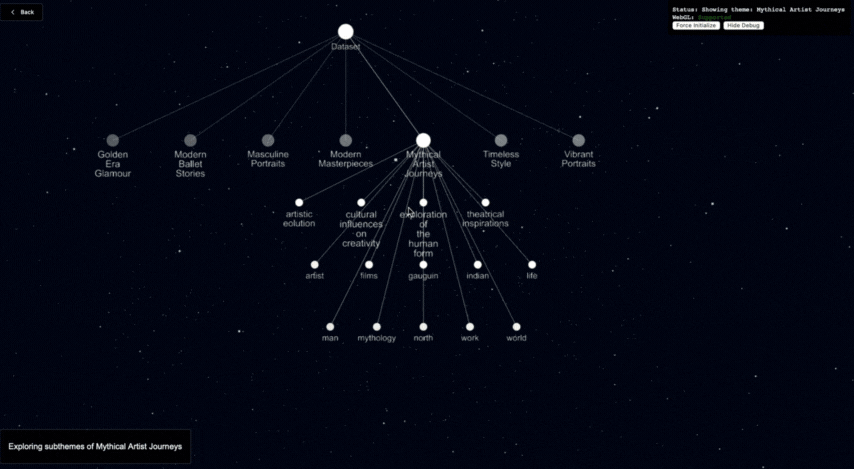
2. Tree Diagram
By assigning theme and sub-theme filters to data points, the diagram offers users a way to narrow down the information. The ultimate goal is to balance the vast, exploratory feel of navigating a galaxy with just enough guidance to prevent users from feeling overwhelmed.

3. Book Cover Cloud
Once the data is filtered by theme, books within each sub-theme appear as a drifting cloud of covers, gently moving together. This creates an intuitive and visually engaging way for users to explore the archive more deeply by clicking into individual entries.
Users can zoom in and interact with individual books, navigating deeper into the archive until they find what they’re looking for.